
The Bell Curve graph is a powerful way to render a symmetrical depiction of a probability distribution.
The data used relies on statistics, a fascinating part of mathematics. Statistical analysis is used to calculate the distribution of a particular event and calculations provide the probability of such event.
Probability Distribution Concepts
Let us assume that you want to measure the likelihood of a particular trait. For this example, we will use a research project that requires measuring the IQ scores of a large group of people, say across a continent or the entire planet.
The researchers can certainly perform IQ tests on some people, but it would be impossible to measure the IQ scores of all people on earth.
As intelligence levels are rather evenly distributed across populations and parts of the world, we would expect IQ scores to be normally, or symmetrically, distributed.
As such, researchers could then measure the IQ Scores of a representative number of people and use those results to deduce a close to accurate prediction of the distribution of various IQ scores and of the intelligence level of the entire population (Hogg et al., 2014).
Conversely, tornadoes are asymmetrically distributed. There are more tornadoes in some geographical regions and less, or none, in others. If you measured the number of tornadoes in the Central US, it would be very different from the number of tornadoes in Central Europe, for example.
We would expect this non-normal distribution to be asymmetrical or skewed.
There are complex mathematical models to predict skewed distributions, but we will focus on normal distribution models here.
What is a Bell Curve
The graphical interpretation of a normal distribution is made via a Bell Curve, so named because it has a shape that is reminiscent of a bell.
A Bell Curve assumes that there is a predictable spread of a particular event. It is the most common type of graphed data distribution.
Below is a graph of an IQ Bell Curve.
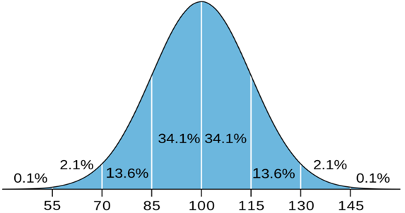
Figure 1. IQ Distribution
The Bell Curve has two primary metrics: the Mean and the Standard Deviation.
The mean represents the unbiased assessment of the most probable outcome. All other occurrences fall equally on each side and create downward slopping lines. In our example in Figure 1 above, the mean IQ score measured is 100.
Standard Deviations measure the deviation ticks from the mean value and how dispersed the observations are in relation to the mean (“Standard Deviation,” 2021).
Bell Curve Standard Deviations
Below are examples of both a large and a small standard deviations.
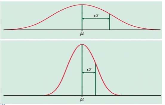
Figure 2. Standard Deviations. Source (“Standard Deviation,” 2021)
In the upper graph of the chart in Figure 2 above, we see the data distributed far from the mean.
A large standard deviation means that there is much variability in the observations.
In the lower graph of the chart in Figure 2 above, we see a smaller standard deviation. Thus, the observations are more clumped to the mean.
A small standard distribution means that there is little variability in the data, and most of the data is closer to each other (“Standard Deviation,” 2021).
The second meaning of the standard deviation is from a probabilistic point of view (“Standard Deviation,” 2021).
In our example, the graph shows that the mean IQ score is 100, as shown in Figure 1.
Most people are closer to the average IQ Score, and scores above 130 and below 70 are rare. The way to quantify the likelihood of either occurrence is via its standard deviation units.
Each standard deviation unit represents a particular variability in the data set.
One would need to adjust to 3 deviations from the mean, to cover almost all the variability in the bell distribution of the IQ Distribution graph in Figure 1 above.
There, the graph is color-coded, but one could observe the first, second, and third standard deviations.
We see that the third deviation covers almost all the variability seen in the population, as it covers 99.7% of all possible IQ scores.
The number of observations is the black line on the chart that arches at the middle. In this case, each deviation represents a tranche of 15 IQ Score points. We note that the farther one is from the mean, the fewer observations we have.
Bell Curve Percentages
One standard deviation away from the mean covers IQ scores between 85 and 115 and represents approximately 68.2% of all the variability in the population.
The second standard deviation from the mean adds IQ scores between 70 and 85 and also between 115 and 130. Combined with the scores from the first standard deviation, these scores represent approximately 96% of the variability in the population. Of course, the second standard deviation reflects fewer observations than the first deviation, as IQ scores between 70 and 85 or from 115 and 130 are less frequent.
The third standard deviation from the mean adds scores between 55 and 70 and also between 130 and 145. Combined with the scores from the first and second standard deviations, these scores represent approximately 99.7% of the variability in the population. Almost all. Of course, the third standard deviation represents even fewer observations than the second deviation as IQ scores between 55 and 70 or also between 130 and 145 are extremely rare.
If we know the standard deviation and the value of the observation, we can work backward to determine how many deviations the observation is from the mean and deduce its likelihood.
If someone has an IQ score of 160, you now know that their 60 points from the mean are four standard deviations away from the mean. One unit of standard deviation being 15 IQ Score points, 60 points divided per 15 per deviation equals four units of standard deviation.
Applications
IQ scores are just the example that we used for this post, but you can use the Bell Curve and standard deviations to estimate the likelihood of all events with normal distributions, including financial trends, business events, data analysis, and much more.
Proton Consulting Group is dedicated to partnering with our clients to create innovative and customized solutions to improve their businesses. Our business consulting services executives, including data analysis experts, bring years of experience successfully advising and deploying data-based solutions that will benefit your organization.